LADY HOME LIVING
It´s always exciting when Jotun Lady is launching a new color chart, because they always manage to come up with the most beautiful colors. This year was no exception of course, and after the press launch I got so inspired that I now want to paint everything in the house in a new color ( yes, I´m even considering replacing the perfect grey that I recently painted in our living room. )
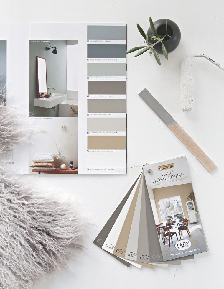
Jotun Lady´s new color chart Lady Home Living reflects a wide range of colors and styles, inspired by cultures and ideas from all continents. The result is three beautiful color palettes; Nordic Living, Urban Living and Continental Living.
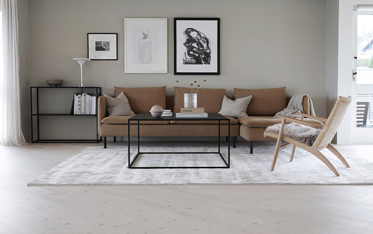
It may not come as a surprise, but the Nordic Living palette is the one that appeals to me the most when it comes to colors for our own home. I agree that they aren´t the most colorful ones in the new color chart, but they have a softness and a warmth that I really like.
There is no doubt that we are moving towards warmer colors these days, and although I usually prefer cold colors, I can feel that I´m currently drawn towards the warmer ones. Maybe it´s because of the season we are in, or maybe I´m just tired of all the black, white and grey that is everywhere – anyway, I´m ready for something new. Are you?
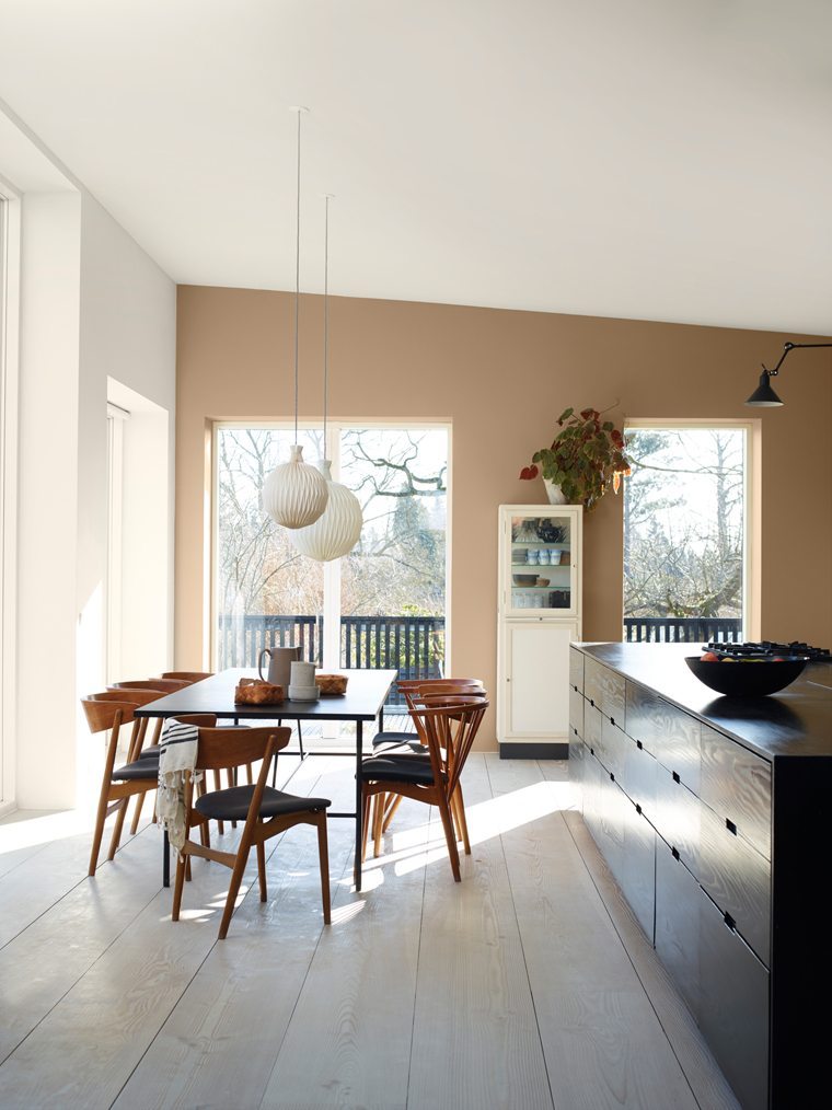
This kitchen used to have white walls, but with the new beautiful LADY 10683 Cashmere on the wall, it looks a lot more interesting I think.
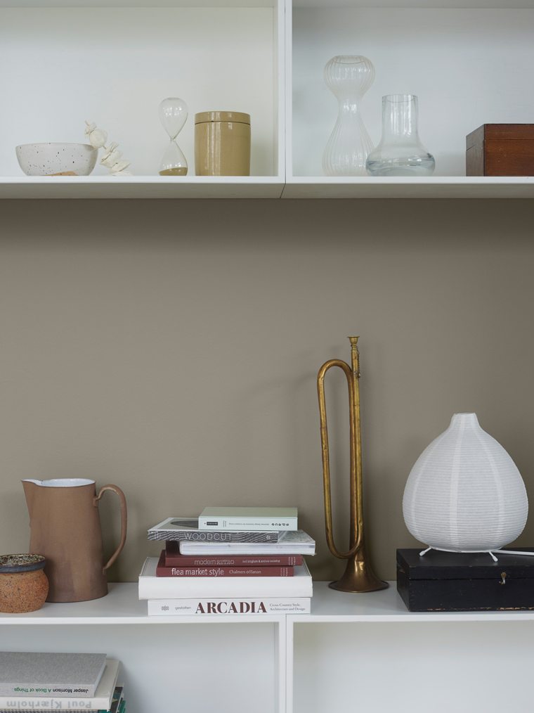
My absolute favorite is the LADY 1352 Form ( above ). It makes the perfect warm and cosy atmosphere that I´m looking for ( without being too warm ), and it looks great with black, white and different kinds of wood that I already have a lot of in the house.
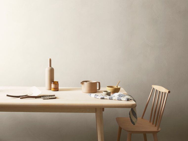
Another one that is really nice is the LADY 10679 Washed linen, here painted with LADY Minerals – soft and delicate.
Together with the new color chart, Jotun Lady also launched a digital color chart. Absolutely worth to check out for inspiration and planning.
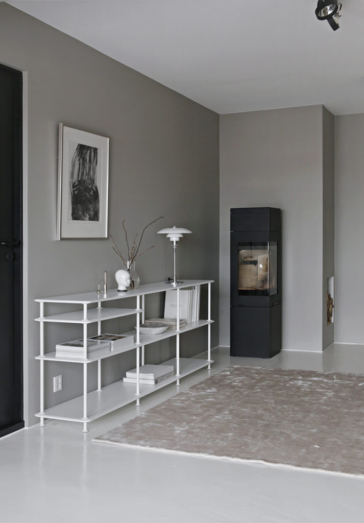
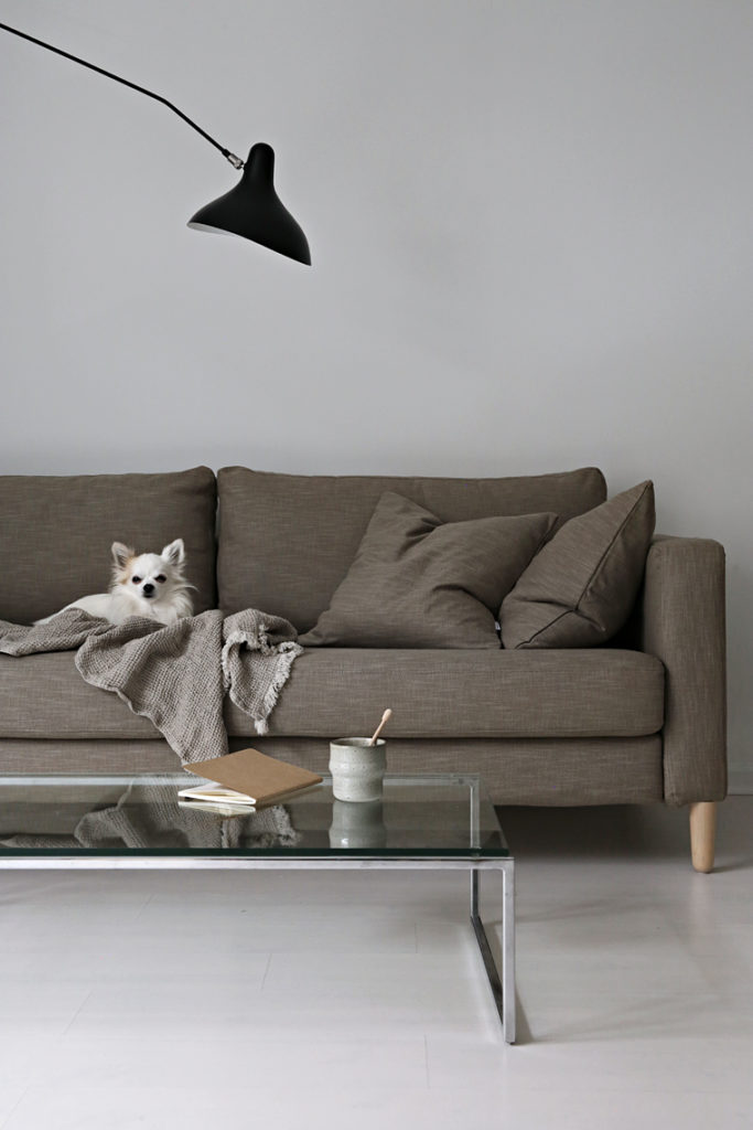
photos © 1: Nina Holst // 2-4: Jotun / LADY