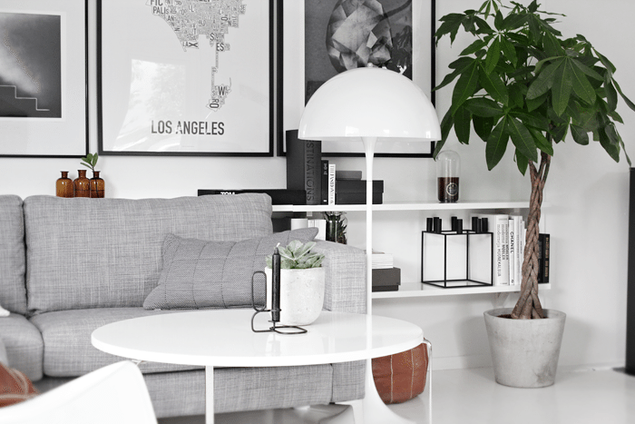
 I really like the brown together with the black, white and grey, but I´m thinking about maybe replacing the brown with something else. Dusty pink maybe? I´ll let you know what I end up with…
What is your favorite combination of colors at the moment? I´d love to hear!
Image: Nina Holst
Dusty pink är superfint! 🙂
Har du tips på detaljer i den färgen tex. Kuddfodral?
Ja, Hay har noen fine puter i dusty pink. Ellers liker jeg godt Bellino krukkene fra Kähler som også kommer i dusty pink.
Olive green is my obsession, and it goes great with “our” couch.. 😉 We’re planning on switching an old leather chair with the IKEA STRANDMON chair in the warm orange color. Yup.. Lots of color going on.. 😀
It´s nice with some changes every now and then… IKEA STRANDMON chair in warm orange sounds like a good idea! I love that chair! I have been thinking about adding more green as well, since I already have some green plant… Olive green is nice 🙂
Nina
Oh I am still deeply in love with the leathery-brown! I’ve decorated my own home with a bit of a 50s style (Eames, Rob Parry): lots of black, white en brown leather so to speak. But I think a nice green like Sine mentioned would be great for your home as well. Goes well with the season too! Personally I’m more of a emerald green kind of girl 😉 Good luck picking your new color, I’m looking forward to your pictures of the end result…. You’ve such a lovely home!
Well, me too, but I can´t have one “look” too long 🙂 So I will put the leather away for a while or use it somewhere else in the house. Or I can use it with green as you and Sine say – that is definitely an option!
Thank you for your feedback and for your compliments on our home!
Nina
Hello, hmmm, pink will be nice 🙂
I love black & white & grey & wood, this is my eternal combination :)….. but never say never 🙂
I am looking forward for the result of your styling work in your living room:)
Hugs!
http://trendesso.blogspot.sk/
Pale dusky pink would be beautiful… but some copper accessories would work well too
I do have some copper that I use every now and then actually. It´s true that copper works very well with dusty pink…
Thank you for your feedback, Frances!
Nina
Hey where did you get the frame for the Los Angeles poster? I have the same poster (thanks to you ;)), but I haven’t been able to find a right sized frame (I live in Finland and that’s not one of our standard frame sizes).
And what’s the name of the coffee table? Where did you get that? Love it! Though I think I’m in love with everything you have in your home 🙂
I am sorry if you have already told both of these things, I must have missed it.
Thank you for all the inspiration, have a nice day! 🙂
Hi Marjo,
I bought the frame at Ikea. It´s a bit bigger than the poster, but since it´s a white paper included in the frame you can´t really tell that the poster doesn´t fill the entire frame. It´s called RIBBA and it´s in size 100x70cm.
I can´t remember the name of my table as I bought it second-hand. It´s a IKEA table that is no longer in production. Maybe you have a second-hand like Finn.no in Finland? Where you sell your used furniture, cars, boats, houses of whatever? I use it all the time… To sell and to buy! Good prices and good for the environment!
Have a nice day! 🙂
Nina
I love your work, Nina Holst! You have so much creativity and is so inspiring! My colors are white (always), lime green, orange and black. It is a tremendous pleasure to receive daily suggestions of your blog, and I even started to draw some feathers to turn them into a picture for one of the walls of my home, like your suggestion! 🙂
Thank you so much for your sweet comment, dear Ana Maria! That makes me very happy to hear! I truly love to inspire.
I´m even more excited about you drawing a feather, and making a picture for your wall! I bet it turned out great, huh? 😉
Wish you a lovely day!
Nina
Maybe you could use this beautiful color: greenwater or turchese to wake up grey and black… This is the color that i use it to your beautiful flat!!!
Thank you for your suggestions, Melody. I will certainly put then into my considerations. I do have a thing for green so maybe…
Heia
Det er alltid så lekkert hos deg, uansett farge du velger vil det garantert bli lekkert.
Jeg satt og studerte hyllene dine bak sofaen i går kveld. Kjempesmart, kikte meg rundt hos meg selv, og ønsket du skulle ha vært i Stavanger for å gi meg en ny vri her hjemme 🙂
Klem
Haha, du er vel skjønn! Så snilt av deg å si – tusen takk, Mette!
Ja, hvorfor ikke slenge opp noen hyller bak sofaen? Det er lett som en plett, og man får en liten annen løsning enn å bare ha sofaen inntil veggen ( som vi fleste nordmenn har :)) Det beste med det hele er jo at man får mer plass til å putte lamper, bøker, blomster og fine ting på. Det var iallefall jeg i mangel på.
Dette fikser du, Mette! Spør meg gjerne om du er i tvil på noe.
Husk å legge opp bilder på Stylizimo.com når du er ferdig, så jeg får se da? 😉
Klem fra Nina
At the moment I love, white grey, light wood and pastel green/blue and a touch of powdered pink. i am very curious for your changes! Have a great day!
Right now in our new Berlin home, I am totally loving the white walls then combining them with natural wood and metallics! I am totally loving the European lifestyle and look!
I have black, grey white and pink and it’s fabulous! I used to go yellow instead of the pink but with 2 girls under 5 the pink snuck in and I kind of like it. Even my husband likes it too!
Burgundy or olive green would be my choices, I think. Though I must admit, I do love brown version very much. x
Så snyggt! Var köper man LA-postern? Tack på förhand! /M
Tusen takk! Posteren med LA har jeg kjøpt på Orkposters.com 🙂
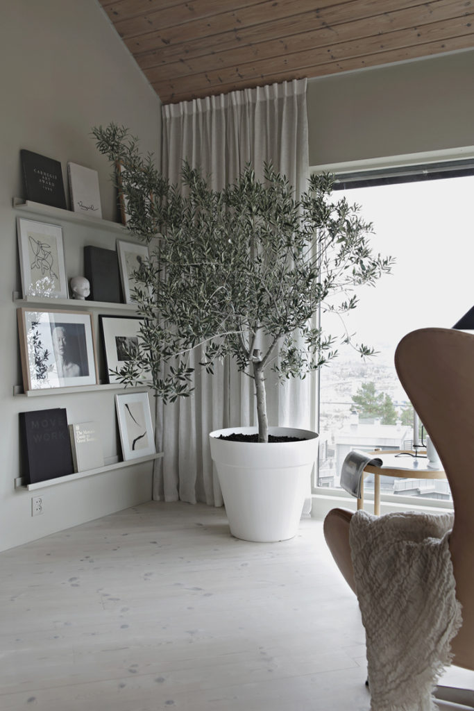
White, light wooden tones (birch for example) and green (in the form of house plants) is the combination catching my eye whenever I see it!
PS! I totally love your shelving solution! I have thought about installing some shelves behind the couch as my coffee table looks really cluttered and I need some storage space. Your photo inspires me to do it more quickly as it looks really fabulous 🙂
Yes, light wood and green plants are certainly a winning combination – I love it!
How nice to hear that you like my shelving solution. I´m very happy with it myself as I needed more space for books and decoration. It´s very easy to make, so you should do it! 🙂
Nina
Nydelig hos deg nå… men kjenner til behovet for forandring.
Jeg nyter hvite gulv og nymalte vegger og tak… Så med hvit base, er det grått, svart og en liten dæsj mint som er mi greie om dagen 🙂
Koser meg med innleggene dine. Inspirerende og nydelige bilder 🙂
Ha en fin, kommende helg!
Klem May Helen
Takk, søte deg! 🙂 Ja , dere har jo virkelig gjort store forandringer. Det har blitt SÅ fint! Kjenner det klør i fingrene etter et litt større prosjekt, men jeg har rett og slett ikke tid om dagen.
Sender en klem fra Drammen. Ha en fortsatt fin helg!
Nina
Hej! Tack för en fin och inspirerande blogg!
Färgmässigt har hade varit mycket kontraster ett tag, svart och vitt till exempel. Men nu känner jag mer för olika nyanser av grått, gärna med inslag av mintgrönt och just lite smutsig/gammel rosa som du nämnde. Annars tror jag att hösten kommer locka oss mot mörkare nyanser, tex väldigt mörk grått eller en blå grön nyans som många benämner Petrol. Vi får se vad som händer med trenderna, en sak är säkert allt hänger samman – ser vi det i heminredningen speglas det i klädmodet och tvärt om.
Tack och trevlig helg!
Heldigvis er det lett å legge til farger om man har sort og hvitt i fra før. Du nevner mange fine farger, så jeg er sikker på at du går en fin tid i møte 🙂
Ellers takk for hyggelig kommentar.
God søndag til deg!
Nina
Hei!
Jeg har bestilt plakaten til høyre av Martin Nicolausson, etter inspirasjon fra din blogg! Jeg har kjøpt RIBBA ramme på IKEA. Da jeg kom hjem var det ikke noe glass i den. Måtte du kjøpe det utenom? Ringte kundeinfo til IKEA uten å bli noe særlig klokere av den grunn….
Takk for nydelig blogg:-)
Mvh Berit
Hei!
Jeg fant det ut selv. Det var jo et plastbelegg jeg måtte dra av den hardplastplaten som var med…. Veldig fornøyd med resultatet. God helg:-)
Berit
Hehe, ja det stemmer! Godt du fant ut av det 🙂 Håper du ble fornøyd med plakaten! Den er knallfin.
God søndag!
Nina
My favourite colours on the moment is a baseof naturelles in combination with ocher yellow, rusty orange and moss green….! Good luck with the changes, looking foreward to see the results!
Thank you for sharing! It´s a nice combination of colors for sure.
Enjoy the rest of the weekend!
Nina