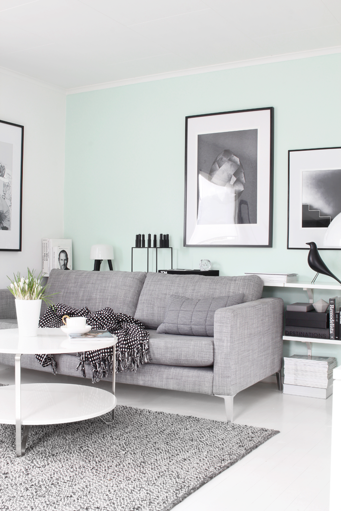
Yesterday I got an urgent need of painting something, and I ended up painting two of the walls in our living room with “Late sommerdager” from Fargerike. I have to say that I thought the color I had chosen would end up a bit different, and I got quite a shocked when I came down this morning (after finishing up last night). It´s a super fresh color, but personally I would prefer it more toned down and maybe with a little more blue in it. I guess I have to find the energy to do the job all over again, after finding a new color… Any suggestions?
Images: Nina Holst
Hei! Så nydelig gulvteppet ved soafen din er! Hvor er det fra? 🙂
I would keep the color…LOVE IT! 🙂
I love this color! The room looks very different, but gorgeous.
Hei Nina!
Så fresht med vårlig farge på veggene 😀
Jeg synes Fargerike sin Valmuesøster er nydelig også.
Ha en fin dag Nina:-)
Klem Therese
Enig, jeg tenkte også på valmuesøster som et fint alternativ 🙂
I don’t know how it looks up close but it’s gorgeous through the photos! Maybe you’ll get used to it in the end!
And I have to say, it was a bit unexpected but a great surprise to find a bit of color in your place Nina! Really really pretty!
Hugs from Crete! xoxo
Hello Nina,
I remember that you said some weeks ago about new trends in colors and you wanted to try it and now when I am watching on new look of your living room …I have to say it is so brilliant, good job Nina and the images are lovely as always.
Hugs!
Lucia
http://trendesso.blogspot.sk/
Jeg synes farven er lidt fersk.. Jeg ville gå efter petroleumsnuancerne her, men jeg er heller ikke ræd for lidt knald på.. 😉
http://www.jotun.com/no/no/b2c/products/interior/lady/lady-spring-summer-2014.aspx 😉
I must say that I like the colour better in the second photo. The contrast with the black lamp and the light wood of the Wisbone chairs is lovely! 🙂
I must say that I like the colour better in the second photo. The contrast with the black lamp and the light wood of the Wishbone chairs is lovely! 🙂
My suggestion would be… ehrm… WHITE!
I like the color, it’s pretty close to the colour in which I have painted one wall in my sleeping room, but I totally LOVED your serene black-and-white with grey and some green plants and woods.
I bought the latest German “Couch-Magazine” in which you were featured, and I liked the article and the pictures a lot. And I was like “HA, I knew her blog before!” 😉
Thanks for doing what you do, please keep going on!
Regards,
Evelyn
Hehe, it´s nice with white. But I´m in need of a change. Hopefully you like the new color I have painted in my living room – it looks much better than this one.
I´m glad to hear that you like the article in Couch-Magazine. I actually got it in my mail today. It turned out really well I think.
Wish you a nice weekend!
Nina
I think the color is just PERFECT!!!!
I just can’t stop looking and admiring 🙂 I really love the contrast of this new wall colour with black, white and wood. And I’m totally in love with the second photo!
Hugs,
Marta
Jeg er enig med deg, jeg ville nok også hatt en litt mer nedtonet farge. Vi skal male kjøkkenet vårt nå, og jeg heller mot Jade fra Jotun. Den ser nydelig ut. Den er nok litt mer blå på den blågrønne skalaen også. Er spent på hva du velger!
If the color looks as good in reality than on pic’s, I would KEEP IT !!! It’s beautiful !
Thank you! I have actually painted over it again, as I thought it was to bright. The new color is much better 🙂
Knallfint syns jeg 🙂
it takes some getting used to, but there’s still something really attractive to that colour – love how it looks in contrasts to all the grey and black!
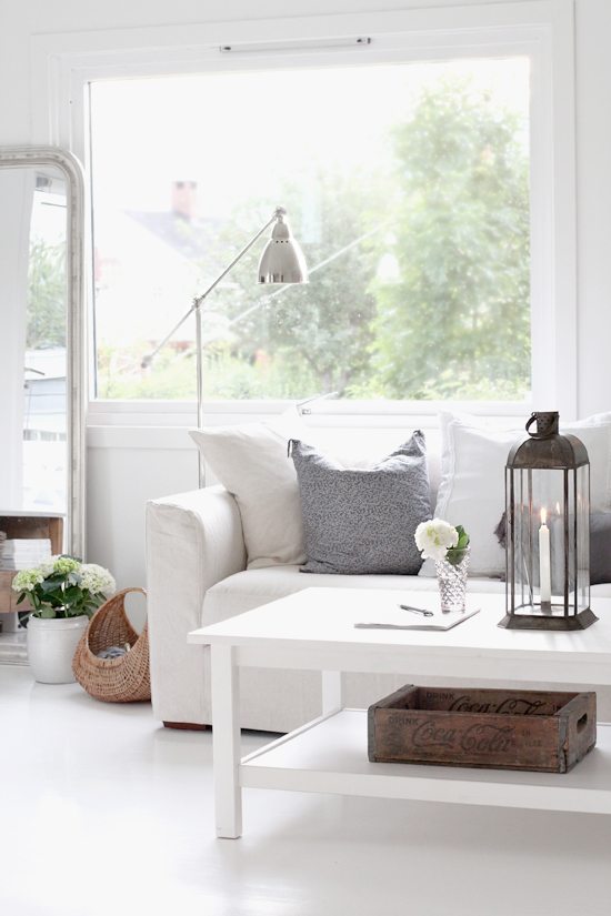
need to ask you, that ‘egg’ picture on your wall – where is that from? so lovely!
Well, I have already painted a new color on my walls. It looks much better now 🙂
The Diamond print is from Arte Limited. I love it!
Hi Nina, I also love it in the second photo with your wishbone chairs, it looks really nice with the pale wood which add some warmth. Can I ask is that the Ikea Basnas rug in your living room? How do you find it? Is it nice and thick or thin? Does it shed? I’m contemplating getting it but not 100% sure yet. Thanks, Maddie!
This colour is nice Nina! http://www.79ideas.org/2013/06/gorgeous-apartment-in-berlin.html#.UyxpvHl4Eds
Kjenn litt på den! Det kan hende den “kommer til deg”. Jeg malte er rom i lys isturkis en gang, og ble helt sjokkert først da den hadde tørket, men ble så inderlig glad i den etterhvert. Noen ganger er farger en tilvenningssak 🙂
In case you feel like painting again, Farrow & Ball have some really nuanced green-blue, bright but muted 😉
[…] Photo: Nina Holst for Stylizimo. […]
Rett og slett DIGGER!
Du er rå Nina:)
Elsker fargen, og jeg elsker spisebordstolene dine…. VIL HA:))
Ha en fin fin helg ♥
[…] Photo: Nina Holst for Stylizimo. […]
When do we get to see the new color?
[…] colors ( this is what you to when your better half is away *smile*. ) . The first one; “Late sommerdager” was a bit too fresh for me, but the second one called “Prekestolen” is perfect […]
It’s certainly a wonderful mint color, Nina, but it is much more elegant the less vibrant tone your chosen end.
kisses
I agree. I like the latest one much for. At least for this room and my style.
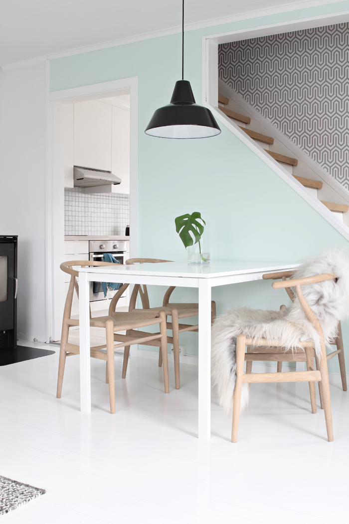
Hej Nina – får jag fråga vad det är för en tapet vid trappan? Just en sådan jag letar efter!
Och – jag håller med dig, den andra gröna tonen var bättre, väldigt snyggt.
Hei Anna. Tapeten er i fra Storeys og heter Dania. Hyggelig at du liker den nye fargen på veggen 🙂
Hi Nina!
Very fresh this color. Lovely!
This blog is amazing.
Hva et fin spisebord du har. Hvor er det fra?
Takk for det 🙂 Spisebordet er i fra Ikea. Et av det billigste de har…
Where is the big poster from? The one behind the sofa
It´s from Arte Limited 🙂
[…] Paper Cms. 2. Linda Ahman. 3. Mobel Pobel. 4. Remodelista. 5. Stylizimo. 6. SF Girl by Bay. 7. Live Themma. 8. Villa Jipp. 9. Stylizimo. 10. Home […]
[…] ♡♡♡ · Cajas de madera y elementos de metal. · Estilo nórdico-industrial. 1 / 4 / 5 / 6 / […]
[…] Stilizimo […]
[…] […]
[…] 出典:http://euf.wrm.mybluehost.me/new-look-in-the-living-room/ […]
[…] Sunroom by Jenna Sue Design Co. | Craft Advisory Textured-Twist Tumbler Closeup | Dining Area Photo by Nina Holst for Stylizimo […]
Love your living room! Gorgeous taste. Where did you get your white rounded coffee table from?!?
[…] image via Stylizimo Blog […]